Responsive Website Design: Guide to Build Mobile-Friendly Sites Google Loves

Mobile devices now account for over 60% of all website traffic globally. Yet surprisingly, many businesses still operate websites that don’t perform well on smartphones and tablets. This isn’t just a user experience problem—it’s a search engine ranking problem.
Google has made it clear that mobile-first indexing and responsive design are core ranking factors. Sites that fail to prioritize mobile usability watch their organic traffic plummet. Conversely, businesses that invest in proper responsive website design see significant improvements in both user engagement and search rankings.
In this guide, we’ll walk you through everything you need to know about responsive website design—from foundational principles to practical implementation strategies that Google rewards.
What Is Responsive Website Design?
Responsive website design is an approach to web design that ensures your site displays optimally across all devices: desktops, tablets, and smartphones. Rather than building separate mobile and desktop versions, responsive design uses a single codebase with flexible layouts and CSS media queries to adapt to different screen sizes.
Why Responsive Website Design Impacts Rankings
According to HubSpot’s 2024 research on web design trends, 85% of users expect websites to be as responsive and easy to use on mobile devices as they are on desktop. When a site fails this expectation, visitors bounce immediately—increasing your bounce rate and signaling poor quality to search engines.
Google’s own data shows that sites optimized for mobile generate more qualified leads, have longer average session durations, and convert at higher rates than non-optimized sites.
Here’s what happens when a site isn’t mobile-friendly:
| Issue | Impact |
| Slow load time | Higher bounce rates |
| Poor mobile UX | Lower engagement |
| Content mismatch | Ranking drops |
| Tiny clickable elements | Frustrated users |
Directory One, a leading responsive website design company, has helped hundreds of businesses across Houston and beyond understand that responsive design isn’t optional—it’s a competitive necessity.
The Three Pillars of Responsive Website Design

Effective responsive website design rests on three fundamental pillars:
1. Fluid Grid Layouts
A fluid grid layout uses percentages rather than fixed pixel widths. This allows your layout to scale proportionally as screen size changes. Instead of defining a container as 960px wide, you’d set it to 100% of its parent element, enabling natural adaptation across devices.
Modern CSS frameworks like Bootstrap and Tailwind CSS have made implementing fluid grids significantly easier, allowing developers to build flexible layouts without writing extensive custom code.
2. Flexible Images and Media
Images and videos must also scale intelligently. The classic mistake is embedding images at a fixed size—when viewed on a mobile device, they either become too small to see or cause horizontal scrolling.
The solution is CSS max-width: 100% on all images, ensuring they never exceed their container. For videos, use responsive video libraries or embed techniques that maintain aspect ratio while adapting to screen size.
3. CSS Media Queries
Media queries are CSS rules that apply different styles based on device characteristics like screen width, height, and orientation. For example:
@media (max-width: 768px) {
.navigation { flex-direction: column; }
.sidebar { display: none; }
}
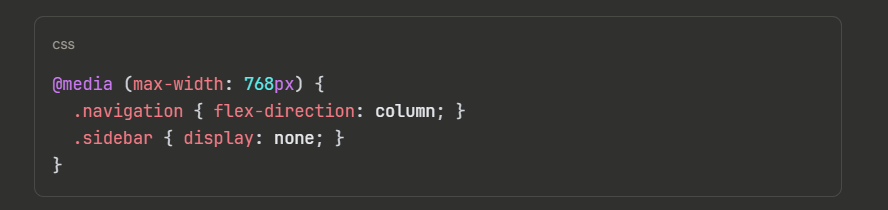
This allows you to completely restructure your layout for smaller screens—hiding unnecessary elements, adjusting font sizes, and optimizing spacing for touch interaction.
Responsive Website Design vs. Mobile-First Design
Many people use these terms interchangeably, but they’re distinct approaches:
Responsive design starts with a desktop layout and adapts it downward for smaller screens.
Mobile-first design builds the mobile experience first, then progressively enhances it for larger screens.
Google recommends mobile-first design because it prioritizes user experience for the majority of visitors while ensuring your site doesn’t bloat with unnecessary desktop features on mobile.
In practice, most modern responsive website design implementations use a mobile-first approach, creating a leaner, faster experience that serves all users better.
How to Design a Mobile-Friendly Website Step-By-Step

Here’s a practical roadmap by experts of Directory One:
Step 1: Audit Your Current Site
Use:
- Google Mobile-Friendly Test
- PageSpeed Insights
- Core Web Vitals report
Step 2: Simplify Navigation
On mobile:
- Use hamburger menus
- Reduce dropdown depth
- Keep key CTAs visible
Step 3: Optimize Page Speed
Compression, caching, and optimized images are essential.
According to HubSpot, faster pages significantly improve conversion rates.
Step 4: Prioritize Readability
- Minimum 16px font
- Proper line spacing
- High contrast
Step 5: Test Across Devices
Use responsive website design tools like:
- Chrome DevTools
- BrowserStack
- Figma preview
Responsive Website Design Tools & Frameworks

Modern developers don’t build responsive sites from scratch. Industry-standard tools include:
| Tool/Framework | Best For | Learning Curve |
| Bootstrap | Rapid prototyping, full-featured components | Low |
| Tailwind CSS | Custom designs, utility-first approach | Medium |
| Foundation | Enterprise-level responsive sites | Medium |
| Next.js | React-based responsive apps | Medium-High |
| Webflow | No-code responsive design | Low-Medium |
Directory One’s team of responsive website design experts regularly evaluates these tools to select the best fit for each client’s needs, whether you’re looking for responsive website design services in Houston or nationwide.
Responsive Website Design Best Practices

1. Design With Mobile First
Start with the mobile layout, then add complexity for larger screens. This forces you to prioritize essential content and create a lean, fast experience everyone appreciates.
2. Test Across Real Devices
Emulators are helpful, but they don’t capture real-world performance. Test on actual devices—especially the devices your analytics show your audience uses. Google’s Chrome DevTools provides device simulation, but testing on real hardware reveals edge cases that emulators miss.
3. Optimize for Core Web Vitals
Google’s Core Web Vitals measure user experience metrics that influence rankings:
- LCP (Largest Contentful Paint): < 2.5 seconds
- FID (First Input Delay): < 100 milliseconds
- CLS (Cumulative Layout Shift): < 0.1
Responsive designs that load slowly or shift layout excessively will struggle in search rankings, even if the layout adapts correctly across devices.
4. Use Relative Units
Avoid fixed pixel measurements (px) for responsive elements. Instead, use:
- rem: Relative to root font size (preferred for scalability)
- em: Relative to parent element font size
- %: Relative to parent container width
This ensures your layout remains flexible and scales proportionally.
5. Plan Breakpoints Strategically
Common breakpoints align with popular device widths:
- Mobile: 320px – 480px
- Tablet: 481px – 768px
- Desktop: 769px+
However, the best breakpoints are based on where your design breaks, not arbitrary device widths. Use Chrome DevTools to resize your browser and identify natural breaking points in your specific design.
The Future of Responsive Website Design

Responsive design principles continue evolving:
- Container Queries: CSS container queries allow layouts to adapt based on parent container width, not viewport width—enabling more flexible, reusable components
- Web Components: Encapsulated, framework-agnostic components make building responsive sites more modular
- Responsive Typography: Dynamic font sizing (fluid typography) automatically scales text between defined endpoints
- Sustainable Web Design: Responsive design for lower-bandwidth networks, reducing energy consumption
The fundamentals—flexible layouts, scalable images, and media queries—remain essential. The implementation tools and techniques continue advancing.
Final Thoughts
Responsive Website Design is no longer about aesthetics—it’s about survival in Google’s mobile-first ecosystem. For businesses seeking expert-level guidance—especially in competitive markets like Houston—Directory One provides structured, data-driven, and mobile-first solutions tailored for long-term search performance.
If you’d like expert support building or refining your responsive website design Houston strategy, contact Directory One at 713.269.3094 or visit https://www.directoryone.com/ to explore how a professionally executed responsive website design service can future-proof your digital presence.
About The Author