4 Reasons Your Business Needs Responsive Website Design

A responsive website design is intuitively developed to work across multiple platforms – offering optimal user experience no matter what device your site visitors use. With mobile internet surfing gaining ground in the past couple of years, Responsive Web Design, or RWD, has become a core web development feature.
Is your website ready to accommodate the ever-increasing wave of mobile visitors? Here are the top four reasons why your business needs a mobile-friendly website:
- Google Recommends Responsive
Google recommends RWD. Google is always looking to enhance the user experience. It favors mobile responsive sites over outdated, static ones due to the improved user experience and faster loading times mobile-friendly sites give – this is especially true when mobile users search for local businesses.
- Unresponsive Sites Get a Bad Rep
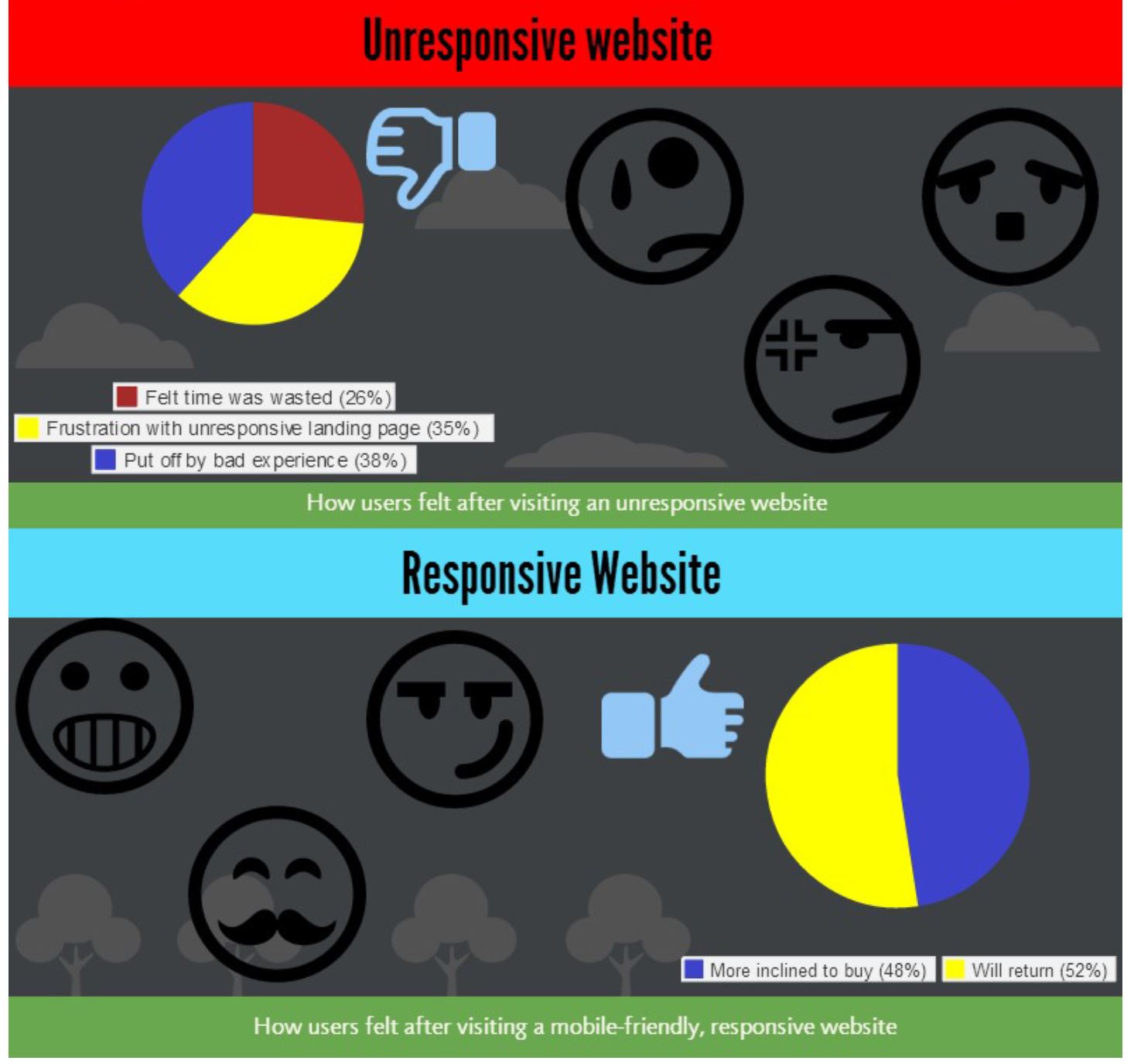
A study from Google conducted by independent market research firms Sterling Research and SmithGeiger suggested that 48% of users expressed frustration when landing on websites that are not responsive. The same percentage showed that if a website didn’t perform well on their tablets or smartphones, they felt like the company didn’t care about their business at all. 36% said they felt like their time was wasted, and a whopping 52% stated that this bad user experience will not make them want to engage with a company.
- Responsive Design Turns Visitors Into Customers (Higher Conversion)
The same study above manifested that 74% of those who checked out mobile-friendly sites stated they were most likely going to be returning visitors, and 67% said they are more inclined to buy a product or service from a mobile-friendly site. Better user experience equals better conversion rate. A responsive website stands a much better chance of engaging site visitors and making them want to stick around to see what products and services you offer.
- Effortless Multiple Device Adaptation
If you have a responsive web design, you can provide great user experience across many devices and screen sizes, and you don’t have to build a standalone mobile site. This means that you can build your online reputations for just one URL. So when your site gets shared online whether on a mobile or on desktop, the content will be clean and easy to navigate. This is an essential web design feature; a website that adapts well in multiple devices is more favorable that a separate mobile site that is limited to a specific device or screen size.
We at Directory One highly recommend that our clients consider responsive website design – this can be extremely beneficial for conversion and for attracting more customers. For more information about our website design and development services, email us at info@directoryone.com or call (713) 269-3094 for a free website consultation.
About The Author