Responsive Website Design Houston?: Guide To Build A Mobile-friendly B2B Website Design
Responsive web design Houston is no longer optional — it is a direct ranking signal for Google and a proven driver of B2B conversions. Over 60% of all web traffic globally now comes from mobile devices, yet many Houston businesses still run websites that break on smartphones.
This guide covers everything you need: what responsive design is, why it matters for SEO, the best tools, a step-by-step checklist, and common mistakes to avoid.
What Is Mobile Responsive Web Design?
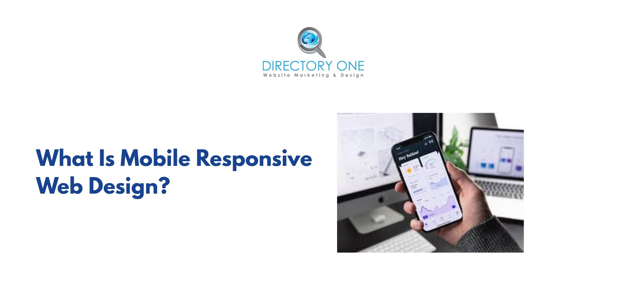
Mobile responsive web design is a development approach where a website’s layout, images, and content automatically adjust to fit any screen size — desktop, tablet, or smartphone — without creating separate versions of the site.
Rather than building three different websites for three different devices, a responsive website uses flexible CSS grids, fluid images, and media queries to detect the user’s screen width and render the appropriate layout. In fact, a professional responsive web design service focuses on:
- flexible layouts
- scalable images
- adaptive content
It results in one URL, one codebase, one consistent user experience across all devices. This distinction matters enormously for SEO. Google uses a single-URL structure as a ranking signal because it concentrates link equity, avoids duplicate content, and simplifies crawling.
According to Google’s own developer documentation, responsive web design is Google’s recommended configuration for mobile-friendly websites.
The Impact of Mobile-Friendly Website Design for SEO

The mobile friendly website design importance continues to grow as mobile usage dominates online traffic. According to Google, mobile-first indexing means search rankings depend on mobile performance. Additionally, Statista reports that more than 60% of global web traffic comes from mobile devices.
Key benefits of responsive website design include:
- improved search rankings
- better user experience
- higher conversion rates
A strong, responsive web design SEO approach ensures better visibility and performance. For Houston B2B companies — whether in energy, manufacturing, professional services, or technology — failing to invest in mobile-friendly B2B website design means losing decision-makers who research vendors on their phones before ever opening a laptop.
Responsive Web Design SEO: How Mobile Design Directly Affects Your Rankings

Responsive web design SEO is not a side benefit — it is the core benefit. Here is exactly how a non-responsive website damages your search rankings:
1. Google Penalizes Non-Mobile-Friendly Pages
Since Google’s full rollout of mobile-first indexing in 2024, sites that are not optimized for mobile receive lower rankings, regardless of how strong their desktop experience is. If your mobile version is broken, your entire site suffers.
2. Slow Page Speed on Mobile Hurts Core Web Vitals
Google’s Core Web Vitals — Largest Contentful Paint (LCP), Cumulative Layout Shift (CLS), and Interaction to Next Paint (INP) — are official ranking factors. Non-responsive sites almost always fail these metrics on mobile. According to Google, pages that meet Core Web Vitals thresholds see up to 24% lower abandonment rates.
3. Higher Bounce Rates Signal Poor Quality
When a mobile visitor lands on a non-responsive page and immediately leaves, Google interprets this as a quality signal. Consistently high bounce rates from mobile traffic suppress your rankings over time.
4. Duplicate Content from Separate Mobile URLs
Some businesses run a separate m.domain.com mobile site. This creates duplicate content issues, splits your backlink authority, and requires extra canonical tag management — all of which complicate your SEO. Responsive web design and search engine optimization go hand in hand precisely because one URL eliminates all of these problems.
Responsive Web Design Houston vs. Adaptive Design: Which Is Right for Your Business?
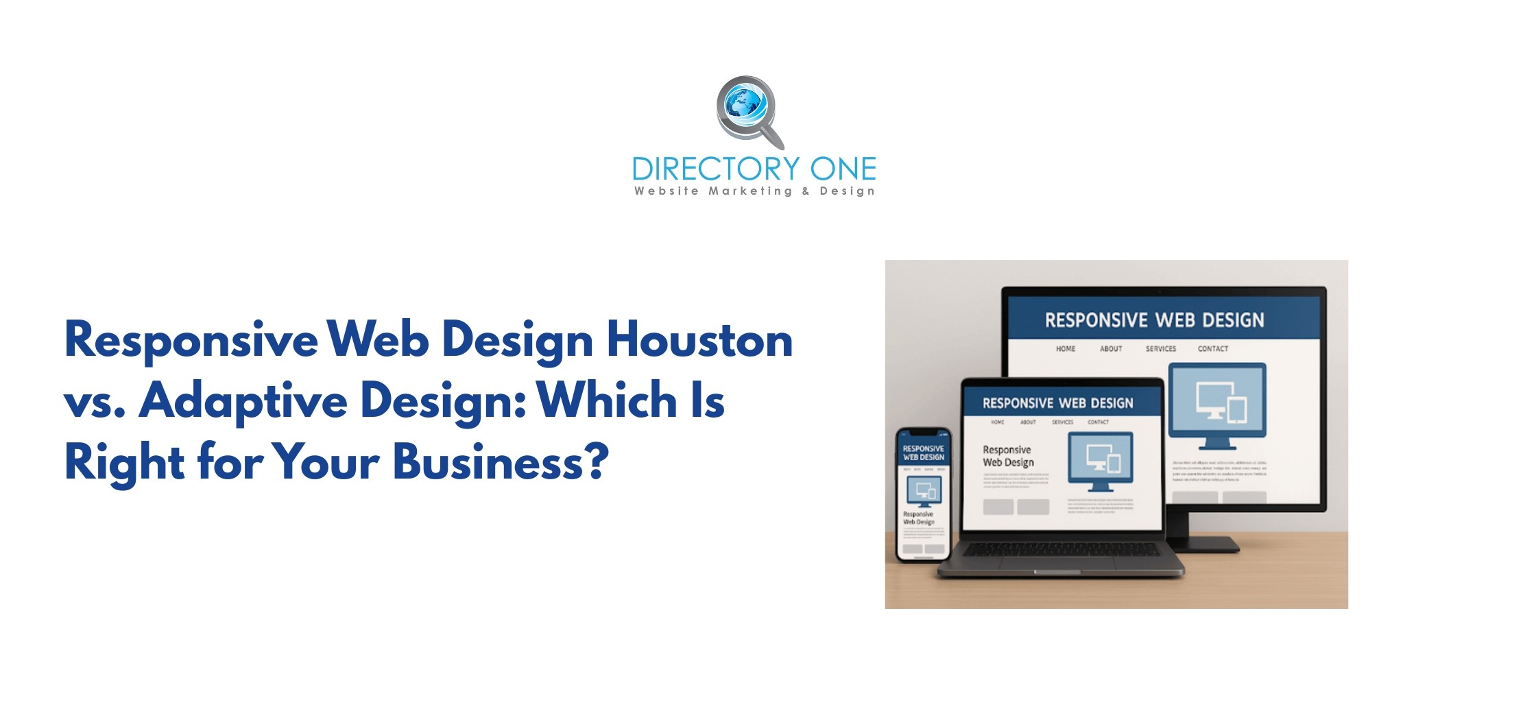
Before hiring a responsive web design agency, understand the difference between responsive and adaptive design:
| Responsive Design | Adaptive Design | |
| How it works | Fluid layout that adjusts continuously | Fixed layouts served at specific breakpoints |
| Number of layouts | One flexible layout | Typically 6 fixed layouts |
| SEO impact | Single URL, preferred by Google | Can use multiple URLs, higher risk of duplication |
| Development cost | Lower upfront investment | Higher — requires multiple template builds |
| Best for | Most B2B websites, content-heavy sites | Large enterprises with complex, device-specific UX needs |
| Maintenance | Easier — one codebase | More complex — multiple layouts to update |
For the vast majority of Houston B2B businesses, responsive web design Houston is the right choice. It costs less to build, is easier to maintain, and performs better in Google’s mobile-first environment.
Benefits of Responsive Website Design for Houston Businesses
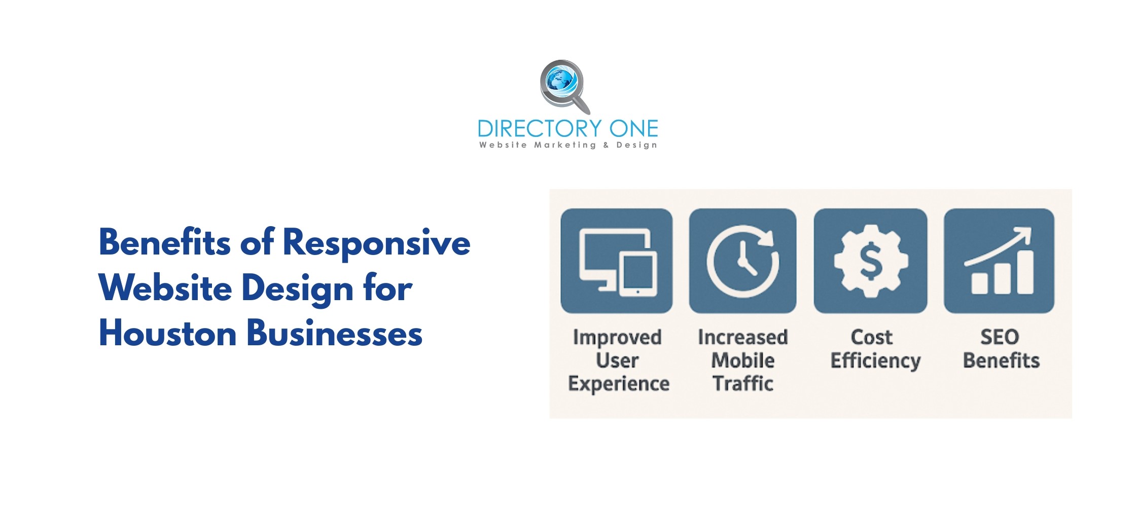
The benefits of responsive website design extend far beyond mobile compatibility:
- Single URL builds stronger domain authority: All inbound links point to one URL, consolidating your SEO equity rather than splitting it between desktop and mobile versions.
- Lower bounce rates, higher engagement: Responsive sites load faster on mobile, reducing the 53% abandonment rate associated with slow-loading pages.
- Improved local SEO performance: Google’s local pack rankings heavily favor mobile-optimized sites. For Houston businesses competing for local visibility, this is a decisive advantage.
- Higher conversion rates: Google data shows that mobile-friendly sites convert visitors at a significantly higher rate than non-responsive alternatives. A seamless mobile experience removes friction at every point in the B2B buying journey.
- Reduced long-term development costs: Maintaining one responsive site is far less expensive than maintaining separate desktop and mobile versions with separate content management workflows.
- Future-proof design: Responsive layouts adapt to new device sizes automatically — meaning your site remains functional as new screen sizes and device types emerge.
Responsive Web Design Houston Best Practices: What Every B2B Site Needs
Applying these responsive website design tips will give your Houston site a measurable performance advantage:
1. Design for Mobile First
Start your design process at the smallest screen size and scale up. This forces prioritization of the most critical content and ensures the mobile experience is not an afterthought.
2. Use a Fluid Grid System
Set column widths in percentages, not fixed pixels. This ensures layouts scale proportionally across any screen width. CSS frameworks like Bootstrap and Tailwind CSS provide pre-built fluid grids.
3. Set Proper Viewport Meta Tag
Every responsive page must include this in the HTML head: <meta name=”viewport” content=”width=device-width, initial-scale=1″> Without it, mobile browsers render your page at desktop width and scale it down — breaking your layout.
4. Optimize Image Delivery
Use the HTML srcset attribute to serve appropriately sized images to each device. Large, uncompressed images are the single biggest cause of slow mobile page loads. Use WebP format where possible — WebP images are typically 25–34% smaller than comparable PNG or JPEG files (Google Developers).
5. Make Touch Targets Large Enough
Google recommends touch targets of at least 48×48 pixels with 8px of spacing between them. Small buttons and links that are difficult to tap on mobile are a direct usability and ranking issue.
6. Avoid Intrusive Interstitials
Full-page pop-ups on mobile are penalized by Google. If you use pop-ups for lead capture, ensure they are dismissible, do not cover the main content immediately on load, and comply with Google’s interstitial guidelines.
7. Test Across Real Devices, Not Just Browser Emulators
Emulators miss real-world rendering issues. Test on actual iOS and Android devices at multiple screen sizes before launch.
Responsive Web Design Checklist for Houston B2B Websites
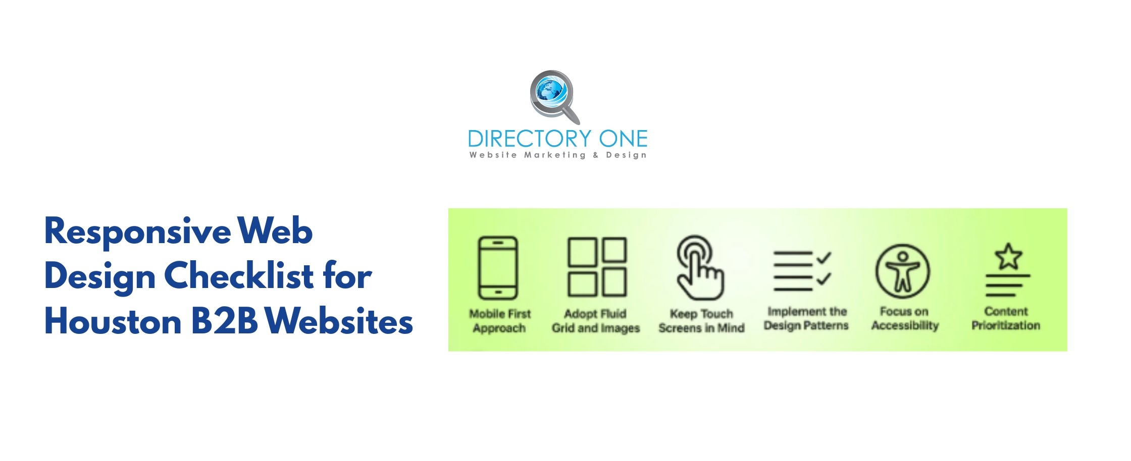
Use this responsive web design checklist before launching or auditing any Houston business website:
Technical Foundation
- The viewport meta tag is present on every page.
- CSS uses percentage-based or viewport-relative units (vw, vh, %) — not fixed pixel widths for layout columns.
- No horizontal scrolling on any device at any screen width.
- Touch targets are a minimum of 48x48px with adequate spacing.
Performance
- All images use srcset or are served via a CDN with auto-compression.
- Images are in WebP format, where browser support allows.
- Page achieves a Google PageSpeed Insights mobile score of 75 or higher.
- Largest Contentful Paint (LCP) under 2.5 seconds on mobile.
Content & UX
- Font size is a minimum of 16px for body text on mobile.
- No content is hidden on mobile that is essential for SEO or conversion.
- Forms are easy to complete on a touchscreen (large fields, minimal required fields).
- Navigation collapses into a usable hamburger menu or equivalent on small screens.
SEO & Indexing
- The site uses a single URL structure (no separate m.domain.com).
- Structured data (schema markup) is identical on mobile and desktop versions.
- Robots.txt does not block Googlebot-Mobile from crawling CSS or JS.
- Canonical tags are consistent and correct.
Testing
- Passes Google Mobile-Friendly Test.
- No critical issues in Google Search Console’s Mobile Usability report.
- Tested on real iOS and Android devices across at least three screen sizes.
- Core Web Vitals pass the threshold in Google PageSpeed Insights.
Responsive Website Design Tool List for Responsive Web Design Houston

These are the most trusted responsive website design tools for building, testing, and auditing your site:
- Google Mobile-Friendly Test (search.google.com/test/mobile-friendly): The official Google tool. Enter any URL and receive an instant pass/fail verdict with specific issues flagged. Free.
- Google PageSpeed Insights (pagespeed.web.dev): Tests both mobile and desktop performance, scores Core Web Vitals, and provides a prioritized list of fixes. Free.
- Google Search Console: Ongoing monitoring of mobile usability issues across your entire site. Alerts you when new problems are detected. Free.
- BrowserStack: Cross-device testing on real devices. Test your site on 3,000+ real browsers and devices, including iOS and Android. Paid, with a free trial.
- Chrome DevTools Device Mode: Built into Google Chrome. Simulates dozens of device screen sizes and allows throttling to simulate mobile network speeds. Free.
- Semrush Site Audit: Crawls your entire site and flags mobile SEO issues, including missing viewport tags, slow page loads, and mobile usability errors. Paid.
- GTmetrix: Detailed page performance reports including Core Web Vitals breakdown, waterfall charts, and historical tracking. Free and paid tiers.
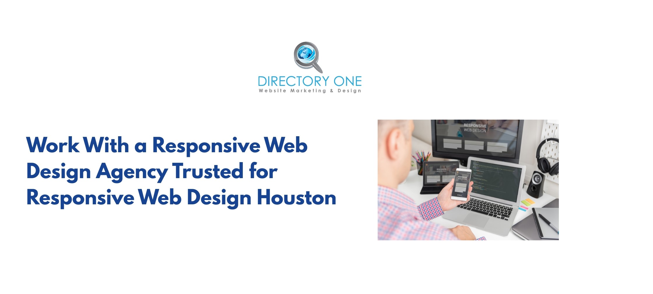
Work With a Responsive Web Design Agency Trusted for Responsive Web Design Houston
Applying everything in this guide takes time, technical expertise, and ongoing monitoring. For Houston B2B companies that need a fully optimized, mobile-first website without the internal overhead, working with a specialized responsive web design agency is the most efficient path.
Directory One is Houston’s trusted responsive web designing company with over 20 years of experience helping B2B companies build and optimize high-performing websites. As a full-service provider of responsive web design services, Directory One delivers:
- Custom responsive web design service built mobile-first for B2B audiences.
- Houston responsive website design with full Core Web Vitals compliance.
- Responsive web design SEO — technical audits, on-page optimization, and local SEO.
- Ongoing listing management, citation building, and Google Business Profile optimization.
- Dedicated account managers who track your rankings, traffic, and conversions monthly.
Final Thoughts
Responsive Web Design Houston is not a technical checkbox — it is a revenue decision. With Google indexing your mobile site first, over 60% of your traffic arriving on a phone, and B2B buyers researching vendors on mobile throughout the purchasing journey, a non-responsive website is actively costing you rankings, leads, and sales.
Use the checklist, apply the best practices, and run the testing tools outlined in this guide. If you need a responsive web design service that handles the technical execution and ongoing optimization, Directory One is ready to help.
As a trusted responsive web designing company, we help businesses create mobile-friendly websites that drive traffic and conversions. Call Directory One today for a free responsive website audit at (713) 465-0051 or visit www.directoryone.com to speak with a responsive web design Houston specialist and get a custom proposal for your business.
About The Author